OVERVIEW
Reimagining the Early Pandemic Grocery Shopping Experience
Timeline: March – May 2020
Focus: Problem Definition • Research Synthesis • Understanding Users • Ideating • Testing Prototypes
Collaborators: Alice Gilmore • Terry Huang
Carte is a tool designed for our “new normal”. Carte is a series of tools designed to help shippers visualize their trips to the grocery store to increase efficiency and limit the time spent in store – but more importantly help foster the spontaneous connections that we find ourselves lacking in quarantine. The printers and postcards help streamline the user experience both for both the grocery store and the shopper.
HOW IT WORKS


RESEARCH
We started with a question: How might we redesign the grocery shopping experience for times of crisis?
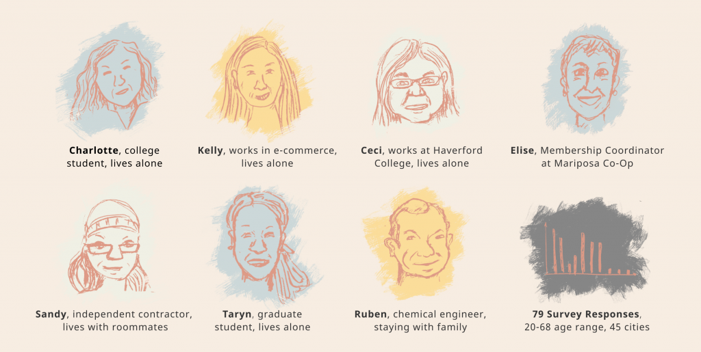
We ran interviews: Six Philadelphia shoppers, one grocery store manager, and two surveys that reached 131 people.
We disproved our initial assumption: people weren’t struggling to find food, but they were struggling to find the control, organization, and small social interactions that usually punctuate the grocery shopping experience when we’re not worried about social distancing.
We also learned that grocery employees are stretched thin: all their energy is going towards staying safe and keeping stores stocked. We realized that any solution we developed couldn’t require extensive effort from grocery staff.
THEORETICAL GROUNDING
We looked into research about happiness and wellbeing when designing this project.
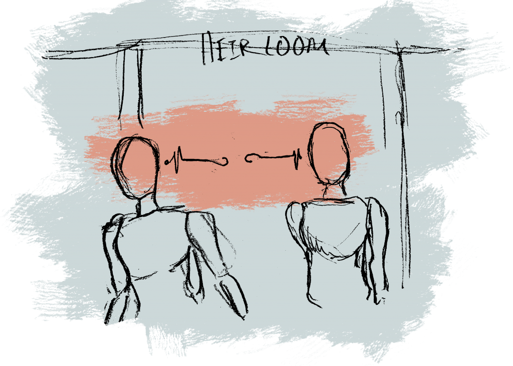
Specifically: the work of Lori Santos, at Yale, who in her research found that one of the biggest contributors to feelings of happiness and well-being is positive interactions with strangers. She cited the impact of technology on social connections, showing that the mere presence of a cell phone – not the use of a cellphone, but just having it visible – reduced the eye contact and smiling between strangers by thirty percent.
Santos, Lori. “Good Screens and Bad Screens”. The Happiness Lab. Podcast audio, April 20th, 2020.
IDEATION
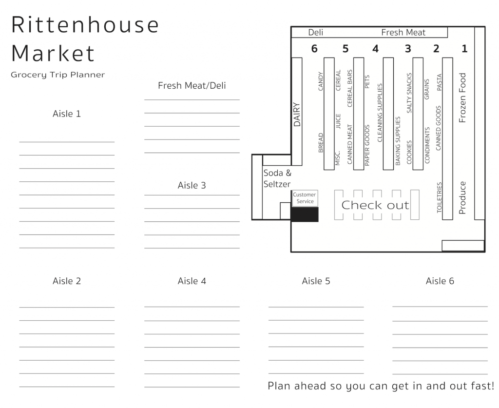
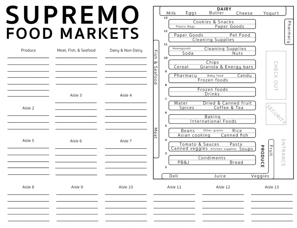
Our ideation led to a grocery store map: instantly useful for shoppers unfamiliar with the store or regular shoppers who are feeling overwhelmed by everything they need to remember.
TESTING
We sent the map to Rittenhouse Market and they loved it – they even posted it on their website! This inspired us to make a few more maps to see how grocery stores and users responded.
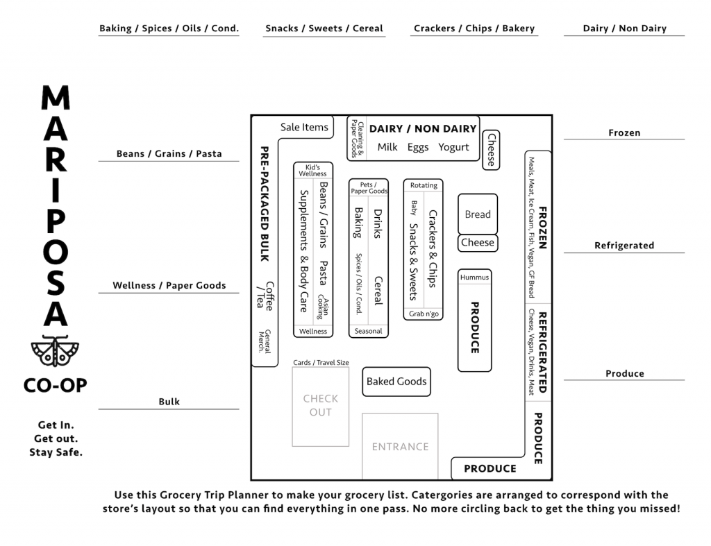
Mariposa Co-Op was also excited about our tool, and besides posting it online they distributed it to their employees in order to assist with stocking and filling online orders.
REFINING
Despite the overwhelming enthusiasm, we saw some pain points in our maps, and decided to take a step back and rethink how the map could be best delivered. We made several versions that are more colorful, to evoke delight in the user, and smaller, so that it could be used in store more efficiently.
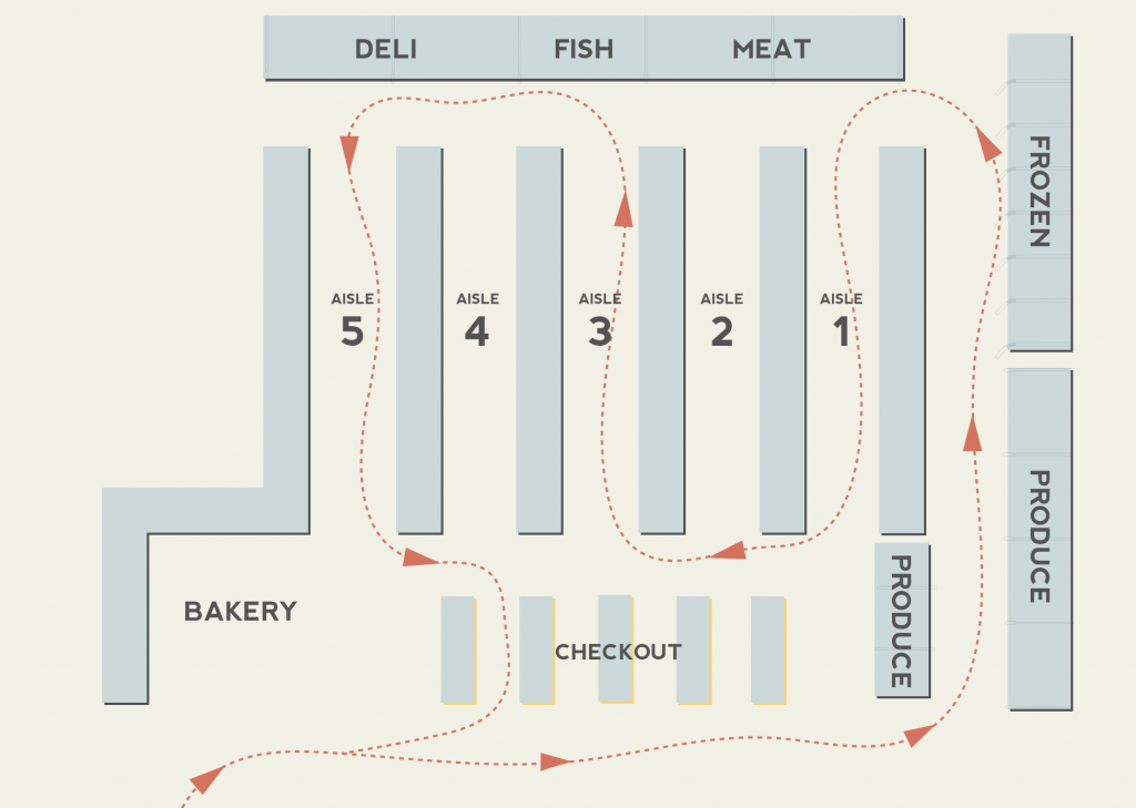
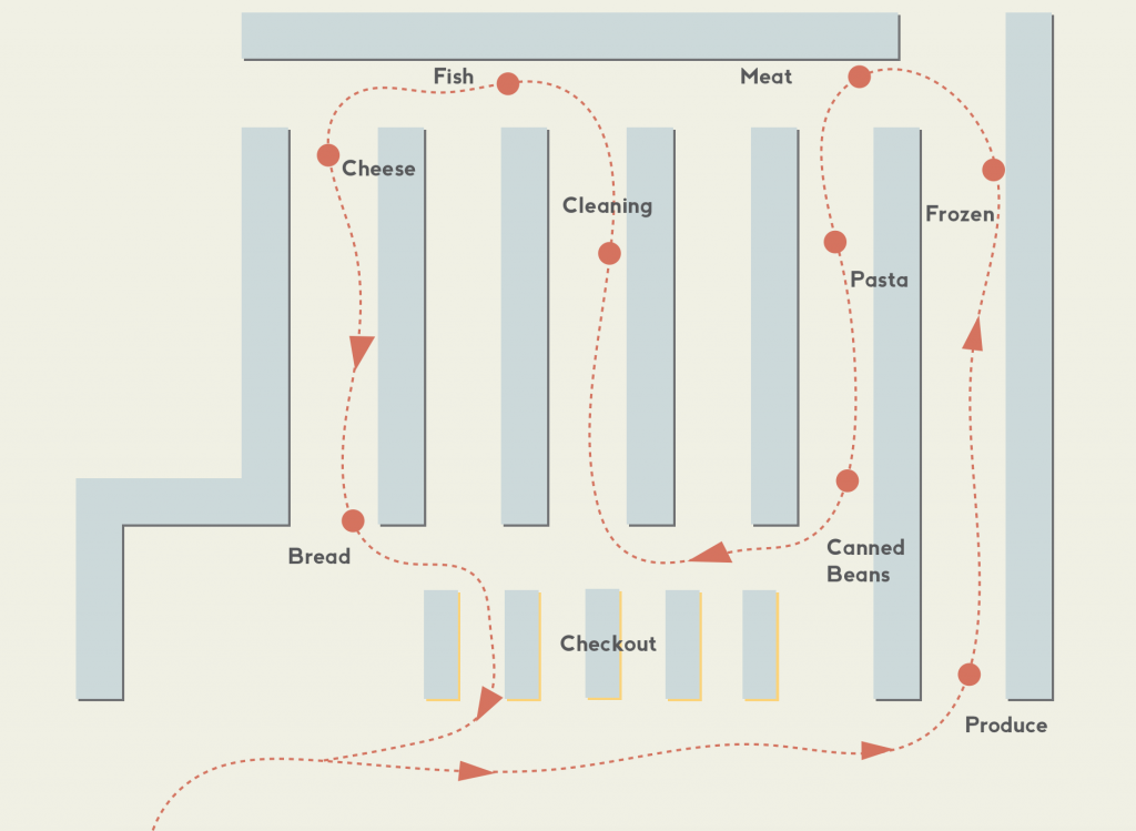
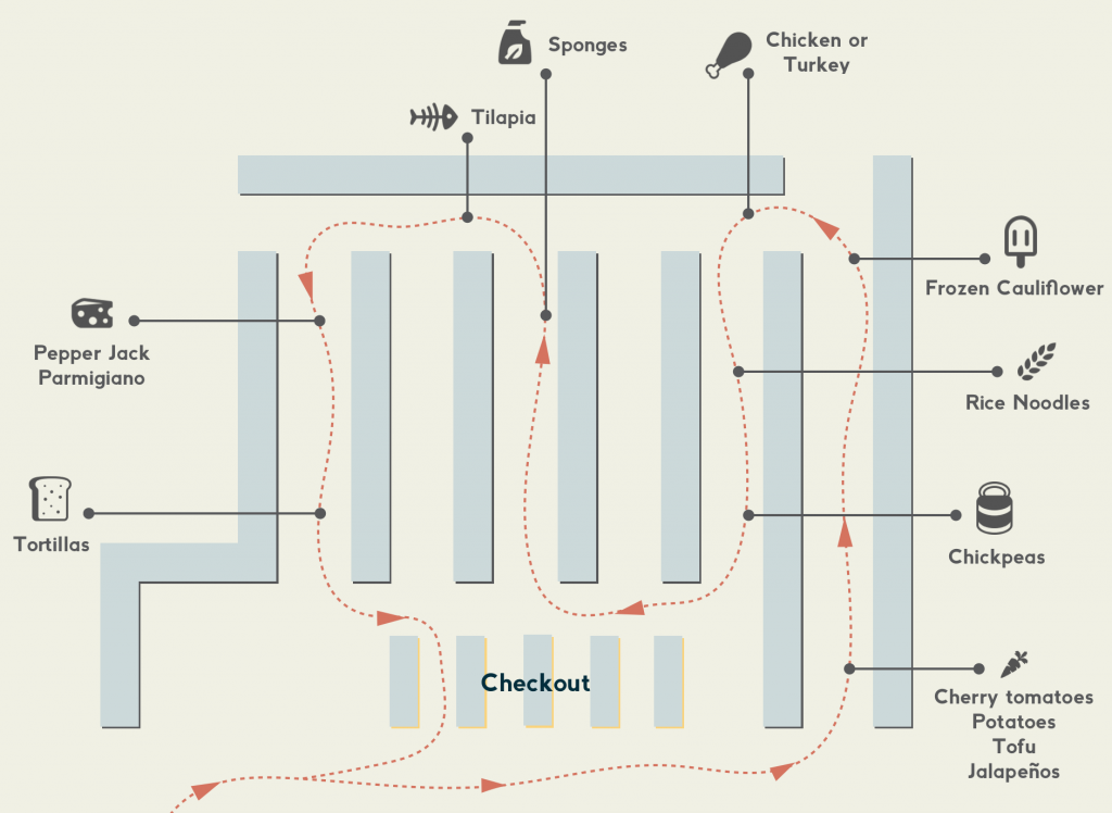
These three versions speak to different levels of detail. In testing our designs, we found that users had a clear preference for the most detailed version – it allowed them to have everything they needed to know at their fingertips.
We also played with the back of the postcard: how to best give users the opportunity to write their shopping list in an organized way, according to their route through the supermarket.
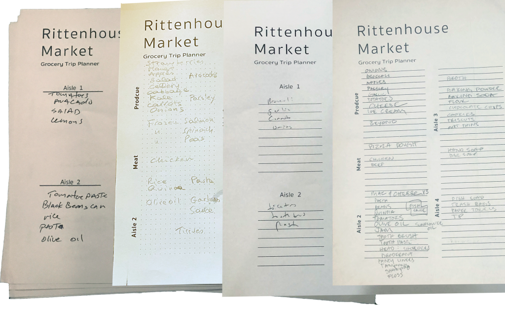
In testing which list users were most excited by we discovered something: the typical list making style (the third one, with headers and lines) was most familiar and thus more useful to users. This was an interesting insight – the more elegant, “designy” solutions (for example the grid dots or the side labels) that we thought would give users more flexibility to fill in the page in their own way were in reality too unusual to intuitively feel helpful.
Finally, we designed the system within which these cards would be circulated, printed, and customized by the user. Carte is intended to be implemented at experience-focused, regional grocery stores, motivated by ties to their communities but large enough to have the data to support our design.
IMPLEMENTATION PLAN
If grocery stores choose to use Carte, we would test our design in three phases.
Initially, we need a more robust pilot test with our postcard map. These maps would be distributed at select grocery stores and collected after use – in order to evaluate the functionality of the map, the size of the postcard, and our graphic choices.
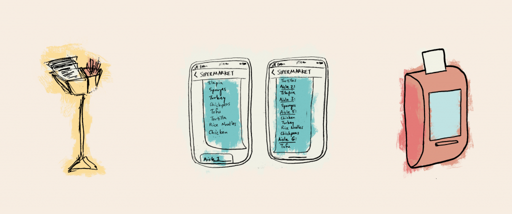
The next phase of testing would be a pilot test of the list re-ordering software. Customers could text their list to the store and then receive their re-ordered list via text.
Finally, we would install the printing stations in grocery stores. Stores rent stations and are responsible for refilling paper. Stations can be either wall-mounted or freestanding, and use inkless printing technologies for limited routine upkeep – any required maintenance will be provided by the vendor.
LESSONS LEARNED
The more important life lesson learned through this project is that so little can be predicted: just a few months later COVID-19 has changed the world so much more than we could have imagined when we began this project in March of 2020. The design-takeaway version of this is 1) the importance of being able to pivot based on new research and 2) being able to let go of insights that have been rendered obsolete by new research – this constant pivoting was also the biggest challenge for me throughout this project.
This project also felt valuable because it allowed me to practice communication skills for launching a design: bringing the right fidelity prototype to the table for client meetings and developing simple tests to gauge customer interest, to name a few.